Building a simple candlestick chart using Docker, FastAPI, and Vue 3 - Part 10
Displaying the chart data

Search for a command to run...
Displaying the chart data
No comments yet. Be the first to comment.
Set up a FastAPI backend to fetch stock data given a ticker, interval, and dates, create a Vue frontend to display the chart, and show how to create a Docker container for easy deployment.
Introduction & FastAPI Backend
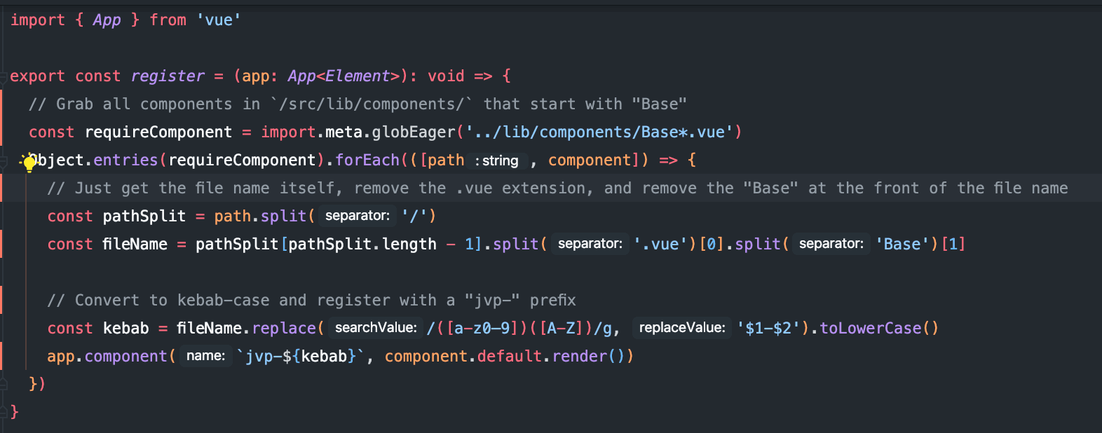
I'm working on a project in my new job and as part of the project I'm trying to register some components globally. As a company we're going to build out a component library and we want to be able to use some components without having to manually impo...
In the last blog post I built the functionality to handle form submission for the file upload itself, but we still didn't have a way to actually handle the files. In this post I'll set up the very basic markup as well as the accompanying script funct...

In the last blog post I touched on setting up a Google Drive folder to serve as the location of our uploads as well as creating the necessary endpoints for uploading and renaming the files. In this post I'll set up functions to send any necessary fil...

In the last blog post I set up a service account to authenticate for Google Drive's API, encrypted the resulting .json file, and set up functionality to decrypt said file to use for the purpose of actual authentication. In this post I will show you h...

Note: all credentials have already been destroyed so there is no need to let me know to not share credential information online. I just finished working on a project for a client/friend in which she wanted to have a page where she could have forms av...

In the last article we set up the event emitter so that when a symbol's data was fetched we could eventually display it in our chart components. The next step will be to create said chart components. We'll want to create two types of charts:
These can be split out into two separate components, but we first need to install the charting library we'll use for this. There are many options one can choose from for charting but the one we're going to use here is a Vue version of ApexCharts, called (creatively) , vue-apexcharts. To install this we simply run
npm i apexcharts vue3-apexcharts
and then we create two components to split out functionality.
The first chart will contain the candlestick functionality, which will be called JVPCandlestick.vue. ApexCharts has
a built-in candlestick chart which we'll use so the
component itself will be fairly simple. In the link you'll see the format the data needs to be, which we've already
addressed in a previous post.
The template section of the component will be fairly straight-forward:
<template>
  <apexchart
      type="candlestick"
      width="100%"
      height="80%"
      :series="series"
      :options="chartOptions"
  ></apexchart>
</template>
where the series and chartOptions values will be set in a little bit. Before we do anything else, though, we need to
update our main.js to globally declare the apexchart component.
// src/main.js
import {createApp} from 'vue';
import App from './App.vue';
import './index.css';

import VueApexCharts from 'vue3-apexcharts';

createApp(App).use(VueApexCharts).mount('#app');
You can see above we've imported VueApexCharts and are using it in the app itself. Now we need to handle the script
section of the JVPCandlestick component.
We will need to include the series to display the data, as well as any other information we want including the symbol and interval, all of which need to be declared as props.
We then will set the chart title to be a computed property that displays nothing if we don't have any series data but will display the ticker and interval whenever we do have data.
Finally, we will set some chart options for displaying the title, the format of the x and y axes, as well as the tooltip.
import {computed, defineComponent} from 'vue';

export default defineComponent({
  props: {
    symbol: {
      type: String,
      required: true,
    },
    interval: {
      type: String,
      required: true,
    },
    series: {
      type: Array,
      required: true,
    },
  },
  setup(props) {
    const interval = computed(() => props.interval);
    const symbol = computed(() => props.symbol);
    const series = computed(() => props.series);

    const title = computed(() =>
      !series.value.length ? '' : `${interval.value} Chart of $${symbol.value}`
    );

    const chartOptions = computed(() => ({
      chart: {
        type: 'candlestick',
        id: 'candles',
        zoom: {
          enabled: false,
        },
      },
      title: {
        text: title.value,
        align: 'left',
        floating: true,
        offsetY: 25,
        offsetX: 10,
        style: {
          fontSize: '2rem',
        },
      },
      xaxis: {
        type: 'datetime',
      },
      yaxis: {
        tooltip: {
          enabled: true,
        },
        labels: {
          formatter: (val) => val.toFixed(0),
        },
      },
    }));

    return { series, chartOptions };
  },
});
With this component now set up, we can include it in the Chart.vue component.
<template>
  <div>
    <JVPCandlestick :series="series" :interval="interval" :symbol="symbol" />
  </div>
</template>
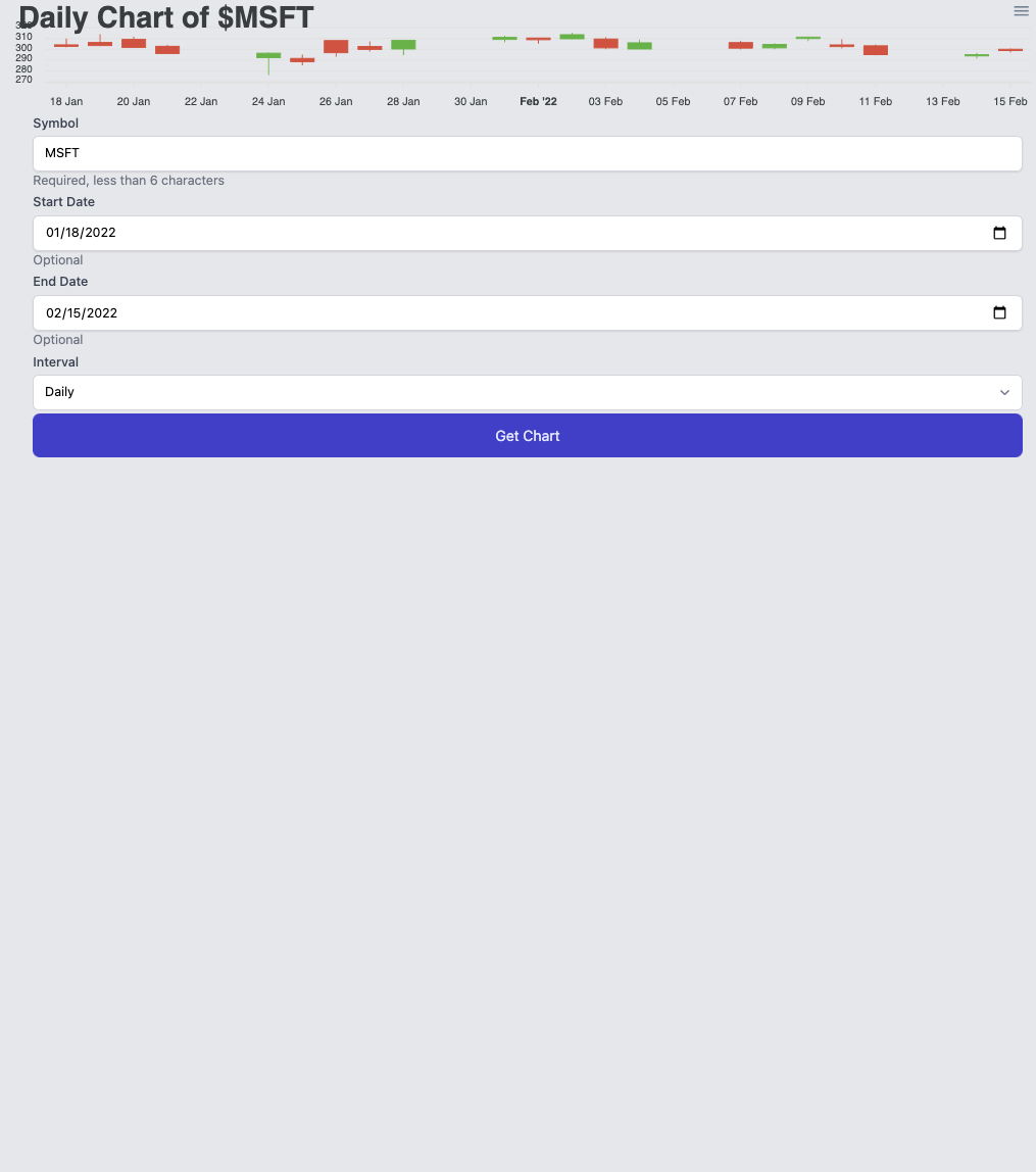
Now a simple search of any ticker should yield the following:
There is a line in the Selections.vue component that provided some broken behavior.
Within the postProcessData method, the state.endDate value, if always fetching a daily chart, would constantly re-set the endDate value to be one day earlier.
A quick fix around this is to simply replace state.endDate = formatDate(dates[dates.length - 1]); with
if (!state.endDate) {
  state.endDate = formatDate(dates[dates.length - 1]);
}
Next we need to set up the volume chart, which will go below the candlestick chart, and will be called JVPVolume.vue.
This is similarly simple, as we will just use a bar chart from vue3-apexcharts.
<template>
  <apexchart
    type="bar"
    width="100%"
    height="20%"
    :series="series"
    :options="chartOptions"
  ></apexchart>
</template>
We then simply pull in the volume prop and set series as a computed property, and similarly set some chart options.
import { computed, defineComponent } from 'vue';
export default defineComponent({
  props: {
    volume: {
      type: Array,
      required: true,
    },
  },
  setup(props) {
    const series = computed(() => props.volume);

    const chartOptions = computed(() => ({
      type: 'bar',
      brush: {
        enabled: true,
        target: 'candles',
      },
      dataLabels: {
        enabled: false,
      },
      plotOptions: {
        bar: {
          columnWidth: '80%',
        },
      },
      stroke: {
        width: 0,
      },
      xaxis: {
        type: 'datetime',
        axisBorder: {
          offsetX: 13,
        },
        categories: props.volume[0]?.data.map((e) => e.x.getTime()) ?? [],
      },
    }));

    return { series, chartOptions };
  },
});
We can then include the JVPVolume.vue component in Chart.vue as
<template>
  <div>
    <JVPCandlestick :series="series" :interval="interval" :symbol="symbol" />
    <JVPVolume :volume="volume" />
  </div>
</template>
and fetching the data for a ticker gives the following result
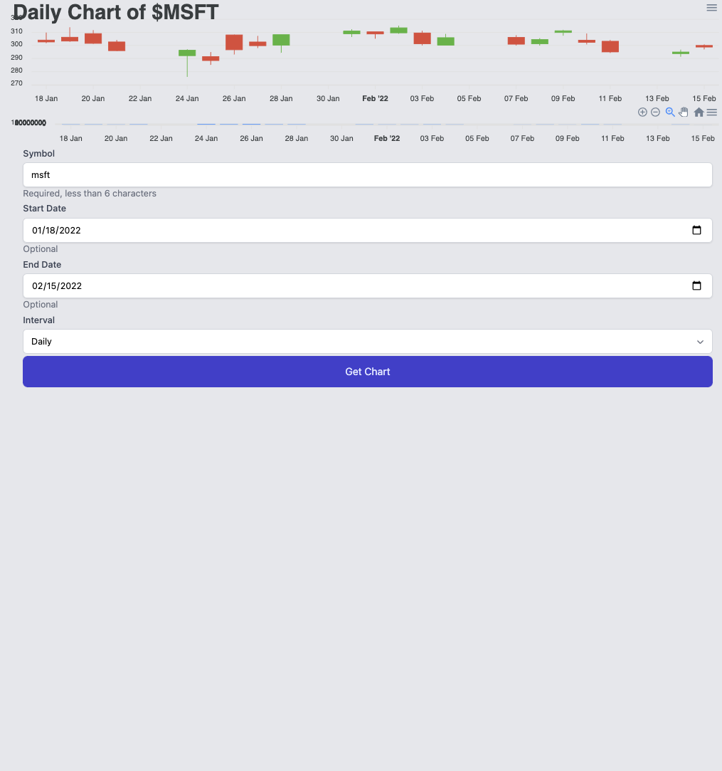 which, admittedly, looks fairly ugly.
To combat this, we'll add some styling to the
which, admittedly, looks fairly ugly.
To combat this, we'll add some styling to the Chart.vue component to make things look a bit nicer.
Chart.vue stylingFirst, we will set the height on the wrapping div, as well as set some flex justification and alignment.
<template>
  <div class="mx-auto h-1/2 sm:h-4/6">
    <JVPCandlestick :series="series" :interval="interval" :symbol="symbol"/>
    <JVPVolume :volume="volume" />
  </div>
</template>
Setting this makes the resulting chart look much better
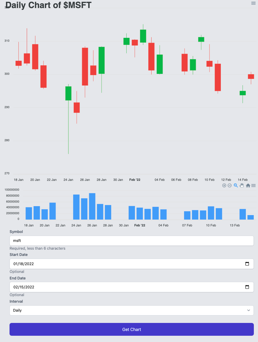 The problem, though, is that when the page first loads and there is no data the page looks somewhat ugly.
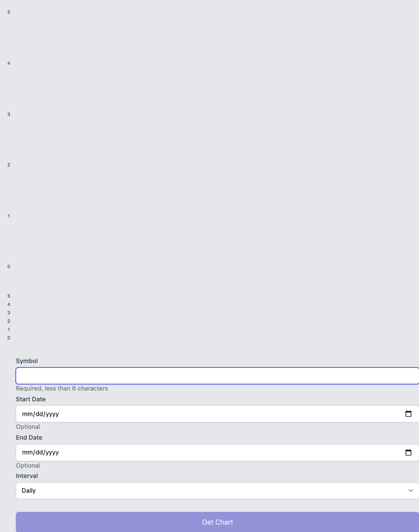
Thus, let's add some dynamic content that will render one thing if we have data, and will render something else if we do not.
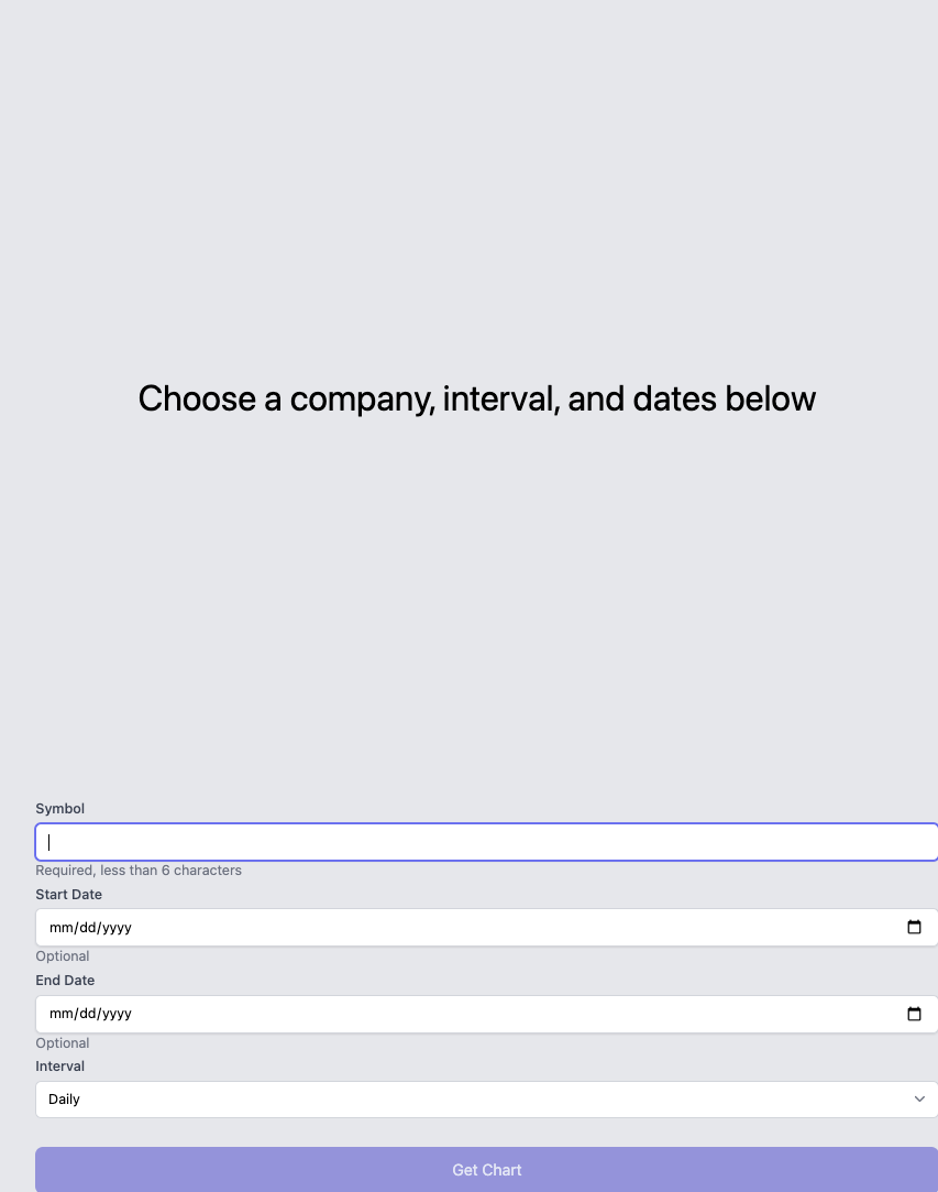
First, we wrap the charts in a div with an if statement, and otherwise display a message.
We will then set some basic styling on these two elements.
<template>
  <div
    class="mx-auto h-1/2 sm:h-4/6 lg:h-5/6"
    :class="series.length ? '' : 'flex items-center justify-center'"
  >
    <div v-if="series.length" class="h-full">
      <JVPCandlestick :series="series" :interval="interval" :symbol="symbol" />
      <JVPVolume :volume="volume" />
    </div>
    <div v-else id="chart" class="text-4xl flex items-center justify-center">
      Choose a company, interval, and dates below
    </div>
  </div>
</template>
The :class attribute in the wrapping div allows us to set styles dynamically.
It has the same functionality as the general class attribute above it, but this allows us to bind the class to something programmatically.
With this set-up, the initial page, prior to loading data, looks like this
With that, we have a simple app that uses FastAPI on the server to fetch data and Vue with Vuelidate and ApexCharts to display data on the frontend. The entire repo can be found at https://github.com/jvp-design/stock-chart-fastapi-vue/