# Building a simple candlestick chart using Docker, FastAPI, and Vue 3 - Part 3

This short article will continue along what was alluded to in [part 2](https://jeffpohlmeyer.com/candlestick-docker-fastapi-vue-part-2).  
Within `Selections.vue` we have three input elements and one select element that are used to receive input regarding stock selection.
We would like to have uniform styling and will be implementing things like input validation so it make sense to compartmentalize these components.
Also, what the hell is the point of using Vue if we're not going to do something like this?
## Custom `JVPInput.vue` Component
We start by creating a simple, generic component
```vue
<template>
  <div>
    <label :for="id">{{ label }}</label>
    <input
      :value="modelValue"
      :type="type"
      :name="id"
      :id="id"
      :placeholder="placeholder"
      class="mx-2 border"
      @input="updateValue"
    />
  </div>
</template>

<script>
import { defineComponent } from 'vue';
import inputProps from '../utils/input-props';

export default defineComponent({
  props: {
    type: {
      type: String,
      required: false,
      default: 'text',
    },
    placeholder: {
      type: String,
      required: false,
    },
    ...inputProps,
  },
  emits: ['update:modelValue'],
  setup(props, { emit }) {
    // This is simply cleaner than putting emit code in the HTML
    const updateValue = (e) => emit('update:modelValue', e.target.value);

    return { updateValue };
  },
});
</script>
```
The functionality of the component is fairly simple: split up the `v-model` directive into `:value` and `@input` functionality, and use passed-in props for the `type`, `id`, and `name`.  

We can see that it looks like some information is missing, namely the `modelValue`, `id`, and `label` values that are referenced within the `template` tag.
These can be found in the `inputProps` object, which is defined in a separate file as
```javascript
// input-props.js

export default {
  id: {
    type: String,
    required: true,
  },
  modelValue: {
    required: true,
  },
  label: {
    type: String,
    required: true,
  },
  hint: {
    type: String,
    required: false,
    default: '',
  },
};
```
The `hint` that is included in `input-props.js` is something that will be used later.

## Custom `JVPSelect.vue` Component
In a similar manner, but somewhat simpler, we create the `JVPSelect.vue` component
```vue
<template>
  <div>
    <label :for="id">{{ label }}</label>
    <select :value="item" :id="id" class="mx-2 border" @input="updateItem">
      <option
        v-for="option in options"
        :key="option"
        :name="option"
        :selected="modelValue"
      >
        {{ option }}
      </option>
    </select>
  </div>
</template>

<script>
import { defineComponent, computed } from 'vue';
import inputProps from '../utils/input-props';

export default defineComponent({
  props: {
    options: {
      type: Array,
      required: true,
    },
    ...inputProps,
  },
  emits: ['update:modelValue'],
  setup(props, { emit }) {
    const item = computed(() => props.modelValue);
    const updateItem = (e) => emit('update:modelValue', e.target.value);
    return { item, updateItem };
  },
});
</script>
```
Like the `JVPInput.vue` component, this is simply moving the functionality that existed in `Selections.vue` into its own component.
### Updating `Selections.vue`
Now with these two components created we will update `Selections.vue` to utilize them.
We then update `Selections.vue` to use this component instead of the generic input component.

```vue
<template>
  <form class="ml-5" @submit.prevent="handleSubmit">
    <div class="my-1">
      <JVPInput
        v-model="state.symbol"
        label="Symbol"
        id="symbol"
        name="symbol"
        type="text"
        placeholder="eg. MSFT"
      />
    </div>
    <div class="my-1">
      <JVPInput
        v-model="state.startDate"
        label="Start Date"
        id="start-date"
        name="startDate"
        type="text"
      />
    </div>
    <div class="my-1">
      <JVPInput
        v-model="state.endDate"
        label="End Date"
        id="end-date"
        name="endDate"
        type="text"
      />
    </div>
    <div class="my-1">
      <JVPSelect v-model="state.interval" label="Interval" id="interval" :options="intervals" />
    </div>
    <button type="submit" class="border">Get Chart</button>
  </form>
</template>

<script>
import { defineComponent, reactive } from 'vue';
import JVPInput from './JVPInput.vue';
import JVPSelect from './JVPSelect.vue';

export default defineComponent({
  components: { JVPInput, JVPSelect },
  setup() {
    const intervals = ['Daily', 'Weekly', 'Monthly'];

    const state = reactive({
      symbol: '',
      interval: 'Daily',
      startDate: '',
      endDate: '',
    });

    const handleSubmit = () => {
      console.log('triggered handleSubmit');
    };

    return {
      intervals,
      state,
      handleSubmit,
    };
  },
});
</script>
```
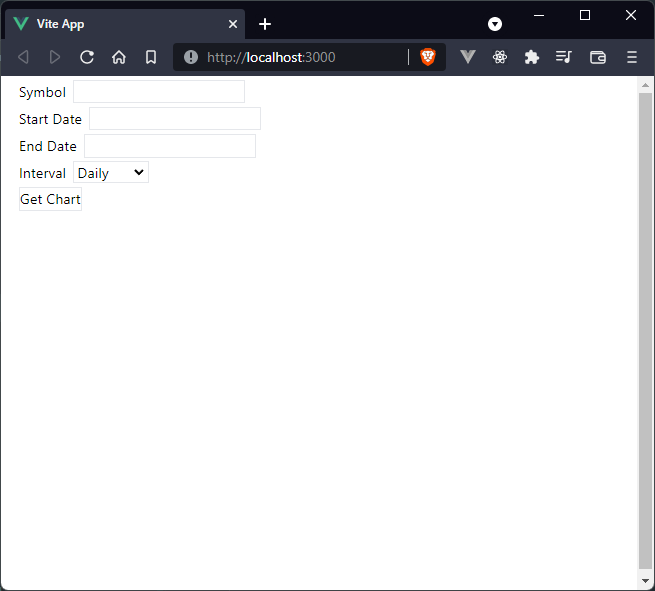
and the app will look no different than before, which is the goal, but it will make further customization much easier.

## Styling
As we saw in part 2, the general app look is fairly ugly.  We'll show it again here for reference.
![img_1.png](https://cdn.hashnode.com/res/hashnode/image/upload/v1637620433351/i_XISfzLvy.png)
We want to add some Tailwind styles to clean this up a little.  In regard to the `JVPSelect.vue` component it won't make much difference than if we had left functionality in the `Selections.vue` component, but for organization it's better this way.
### `JVPSelect.vue`
We'll add simple font styling to the `label`:
- block
- text-sm
- font-medium
- text-gray-700

and slightly more complex styling to the actual `<select>` tag:
- block
- w-full
- pl-3
- pr-10
- py-2
- mt-1
- text-base
- border-gray-300
- focus:outline-none
- focus:ring-indigo-500
- focus:border-indigo-500
- sm:text-sm
- rounded-md

To see what each of these classes do to the element I encourage you to check out the [Tailwind docs](https://tailwindcss.com/docs).
Full disclosure, though, I have purchased a license to [Tailwind UI](https://tailwindui.com/) so a lot of this came from there because I'm terrible when it comes to design independently.
Now, the updated `JVPSelect.vue` component looks like this
```vue
<template>
  <div>
    <label :for="id" class="block text-sm font-medium text-gray-700">
      {{ label }}
    </label>
    <select
      :value="item"
      :id="id"
      class="
        mt-1
        block
        w-full
        pl-3
        pr-10
        py-2
        text-base
        border-gray-300
        focus:outline-none focus:ring-indigo-500 focus:border-indigo-500
        sm:text-sm
        rounded-md
      "
      @input="updateItem"
    >
      <option
        v-for="option in options"
        :key="option"
        :name="option"
        :selected="modelValue"
      >
        {{ option }}
      </option>
    </select>
  </div>
</template>

<script>
import { defineComponent, computed } from 'vue';
import inputProps from '../utils/input-props';

export default defineComponent({
  props: {
    options: {
      type: Array,
      required: true,
    },
    ...inputProps,
  },
  emits: ['update:modelValue'],
  setup(props, { emit }) {
    const item = computed(() => props.modelValue);
    const updateItem = (e) => emit('update:modelValue', e.target.value);
    return { item, updateItem };
  },
});
</script>
```
### `JVPInput.vue`
This component is going to be slightly more complicated.
One of the reasons for this is because we're going to be handling input validation in the `JVPInput.vue` component so we want to have `<p>` tag to display error messages or hints (remember the `hint` element in `input-props.js`???).
We want the labels to match what we already created for `JVPSelect.vue`, though, so that will be the same.
We will also wrap the `<input>` in a `div` element to make alignment a bit better as well as placement of any messages.
To this `div` we will add just a couple of classes:
- mt-1
- relative
- rounded-md
- shadow-sm

and then to the actual `input` element we will add
- block
- w-full
- sm:text-sm
- rounded-md
- shadow-sm

Now the `JVPInput.vue` component looks like
```vue
<template>
  <div>
    <label :for="id" class="block text-sm font-medium text-gray-700">
      {{ label }}
    </label>
    <div class="mt-1 relative rounded-md shadow-sm">
      <input
        :value="modelValue"
        :type="type"
        :name="id"
        :id="id"
        class="block w-full sm:text-sm rounded-md shadow-sm"
        @input="updateValue"
      />
    </div>
  </div>
</template>

<script>
import { defineComponent } from 'vue';
import inputProps from '../utils/input-props';

export default defineComponent({
  props: {
    type: {
      type: String,
      required: false,
      default: 'text',
    },
    placeholder: {
      type: String,
      required: false,
    },
    ...inputProps,
  },
  emits: ['update:modelValue'],
  setup(props, { emit }) {
    // This is simply cleaner than putting emit code in the HTML
    const updateValue = (e) => emit('update:modelValue', e.target.value);

    return { updateValue };
  },
});
</script>
```
And in order to make the actual app look half decent, we'll add a `bg-gray-200` class to the main `div` in `App.vue` and a `px-4` class to the `<Selections />` element in `App.vue`
```vue
<template>
  <div class="h-screen bg-gray-200">
    <Selections class="px-4"/>
  </div>
</template>
```
and the app now looks like
![img_2.png](https://cdn.hashnode.com/res/hashnode/image/upload/v1637620413676/QBxYF37tE.png)
which is still objectively terrible, but we're making progress.
The benefit of what we've done in this step is that we will be able to compartmentalize the error display in the `JVPInput.vue` component and it will keep `Selections.vue` relatively clean.  

In the [next article](https://jeffpohlmeyer.com/candlestick-docker-fastapi-vue-part-4) we'll add input validation to the three `JVPInput.vue` elements, add error and hint message display, and add dynamic styling of the component itself for when it is in an error state.
